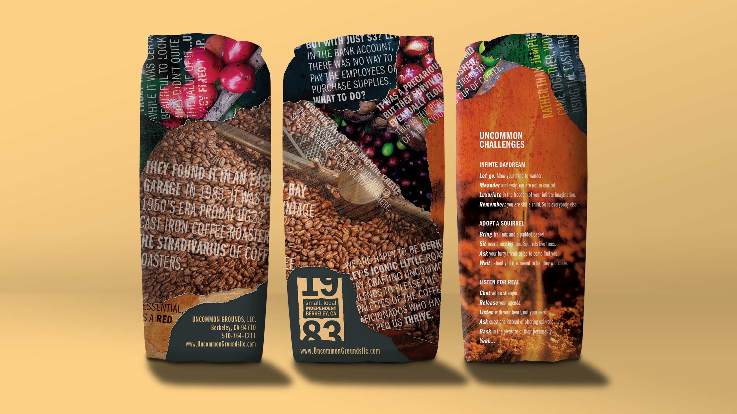
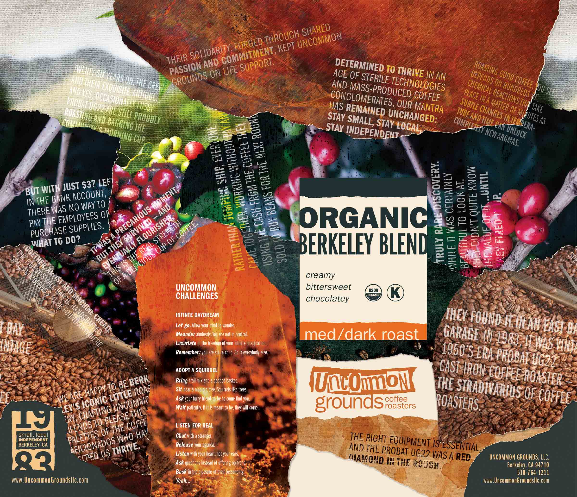
Tapestry of a fragmented past
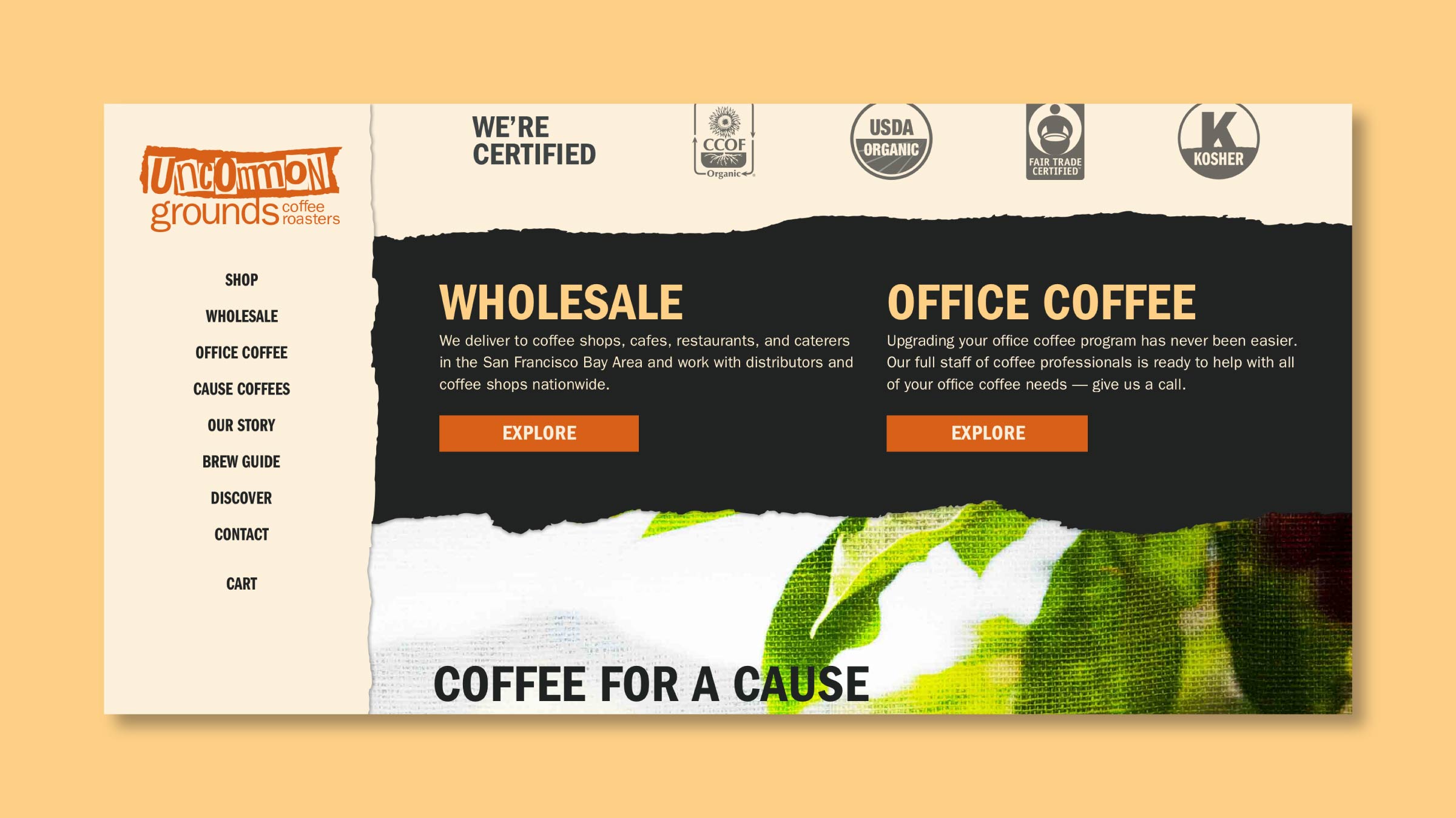
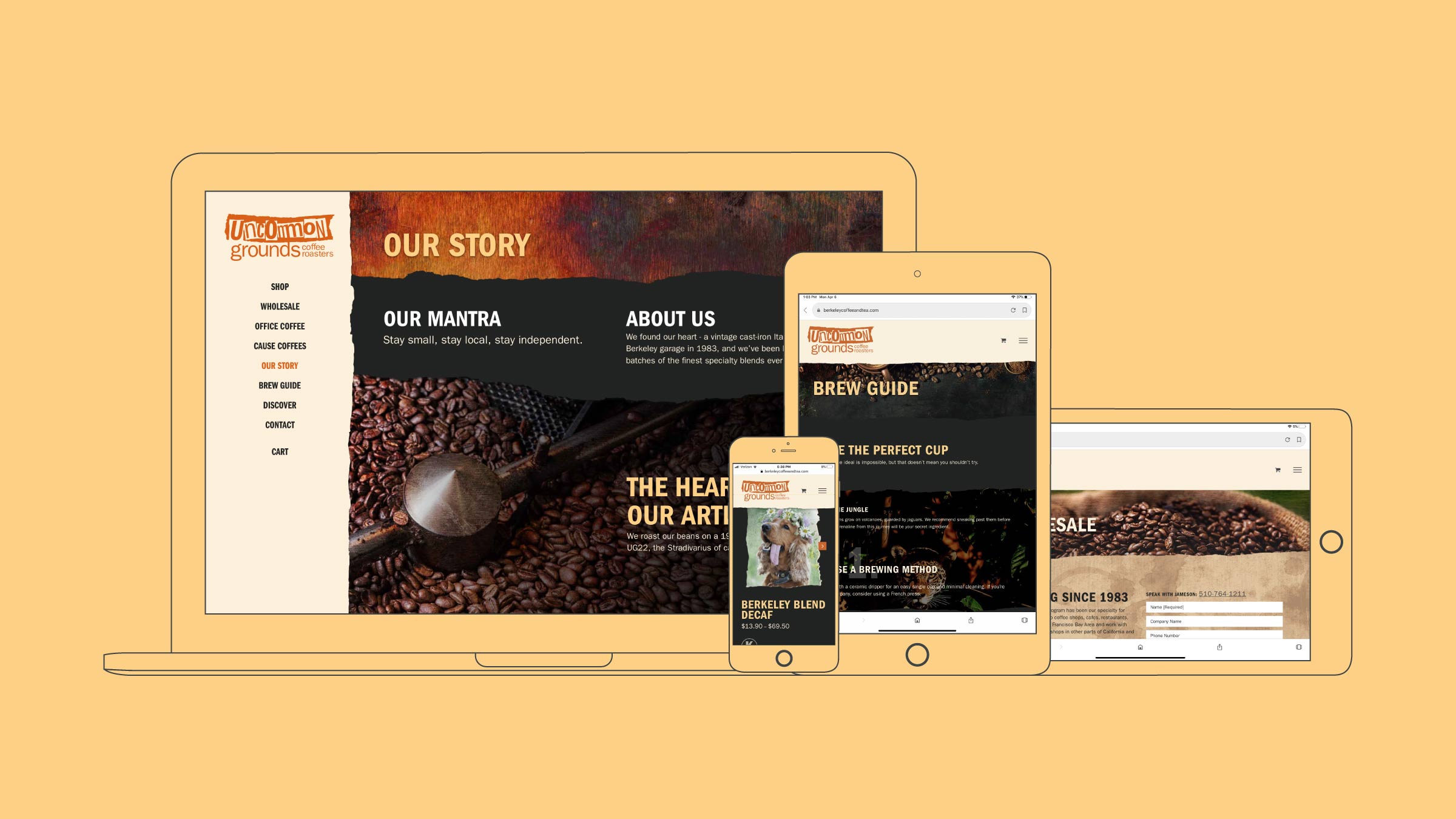
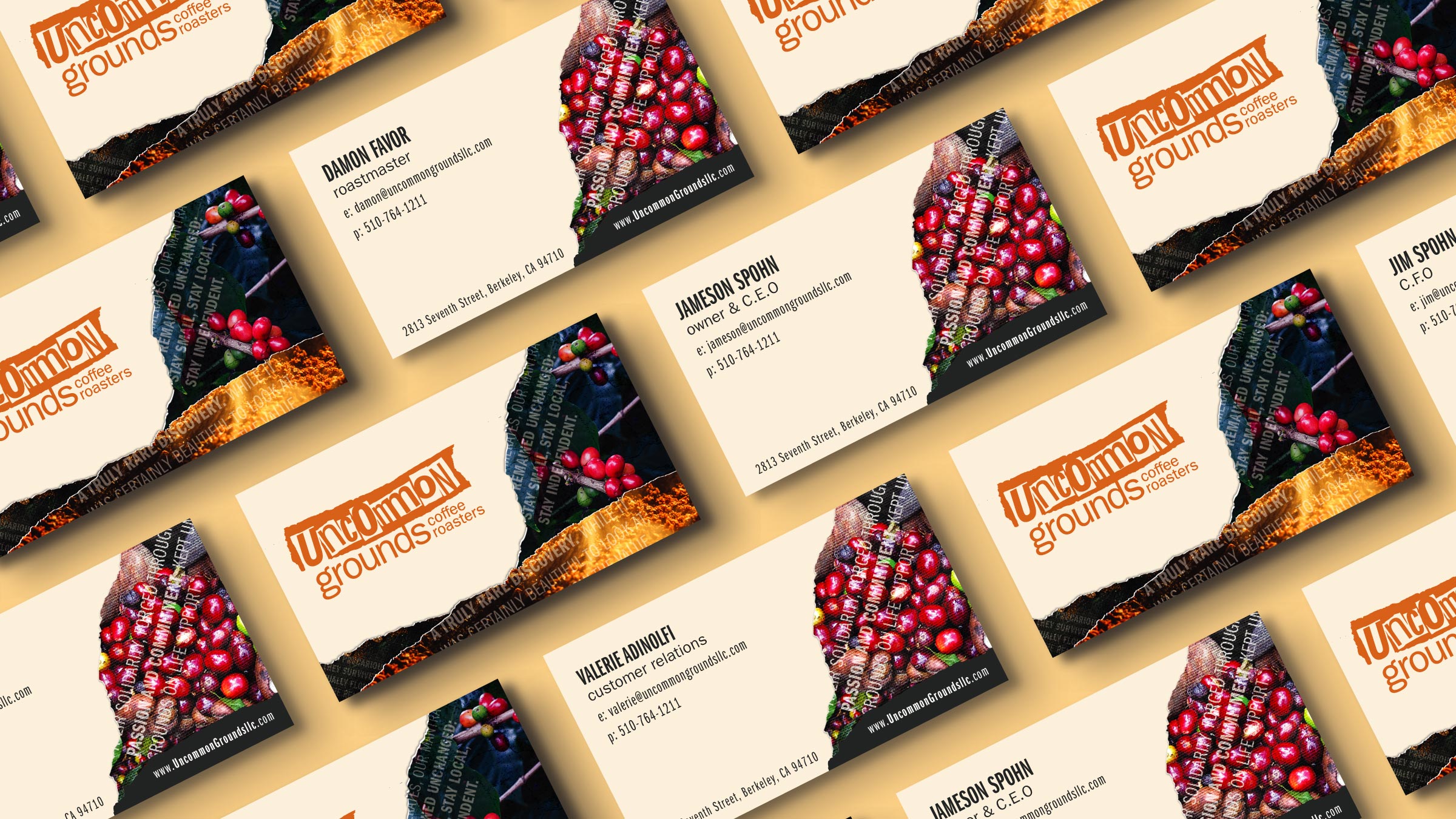
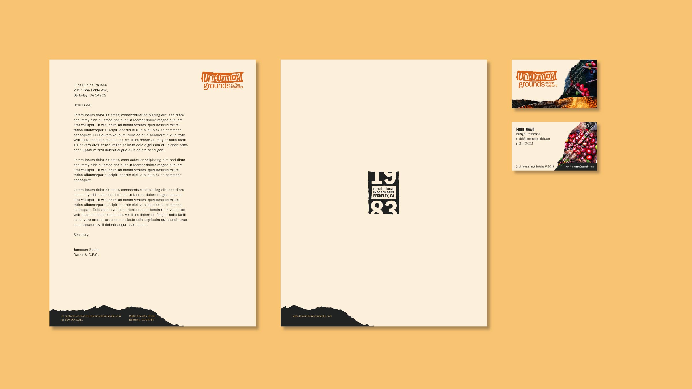
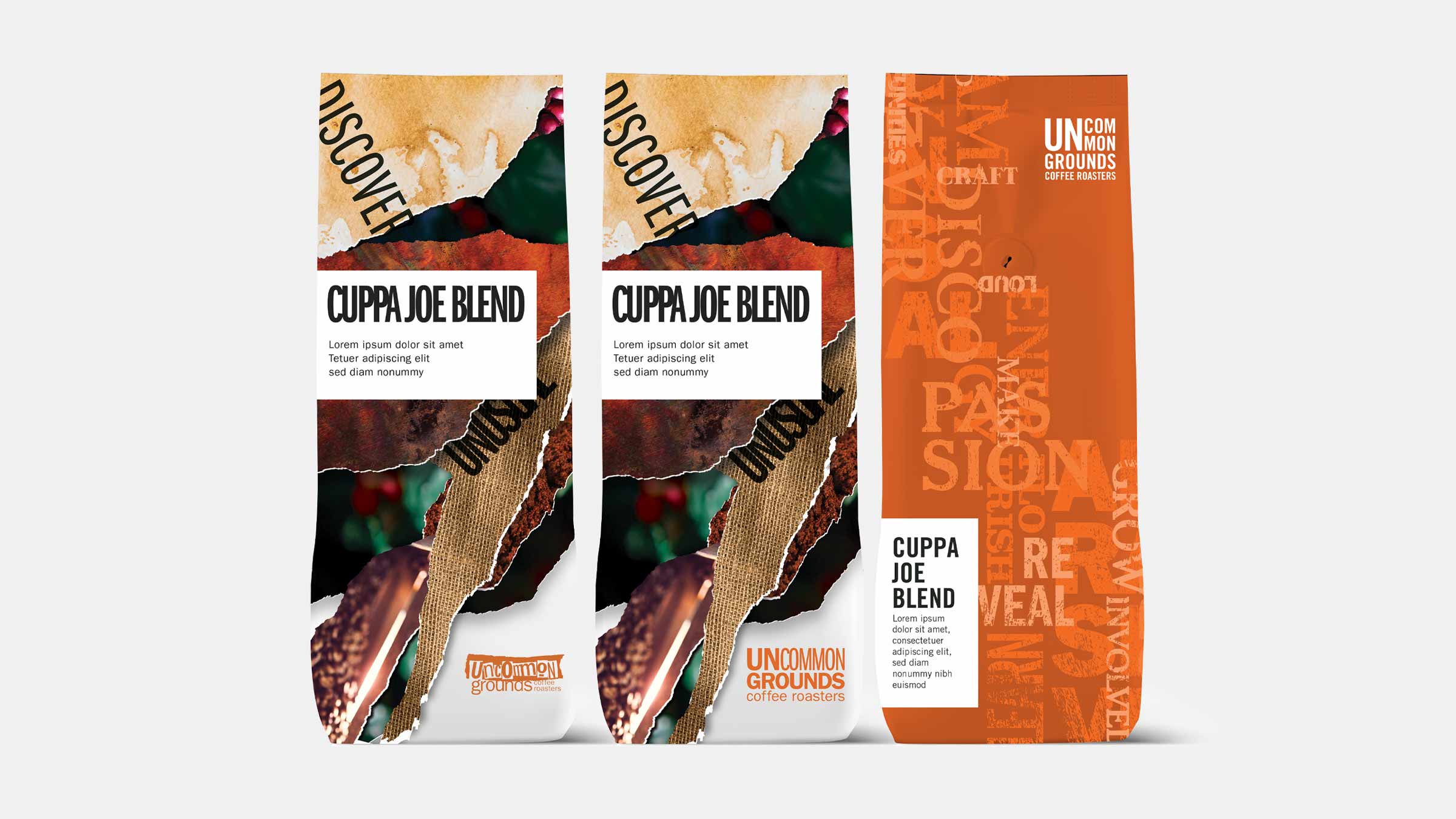
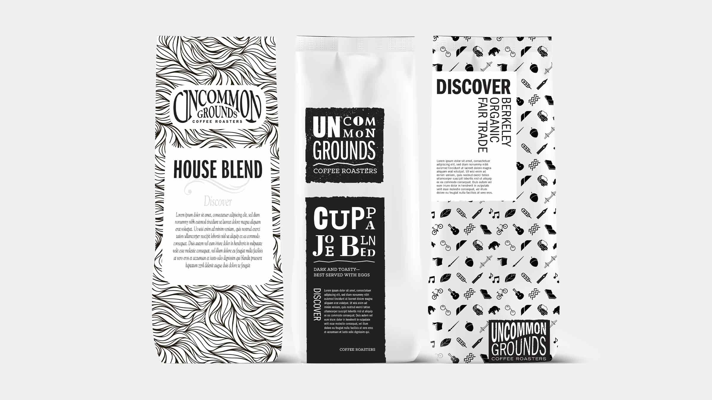
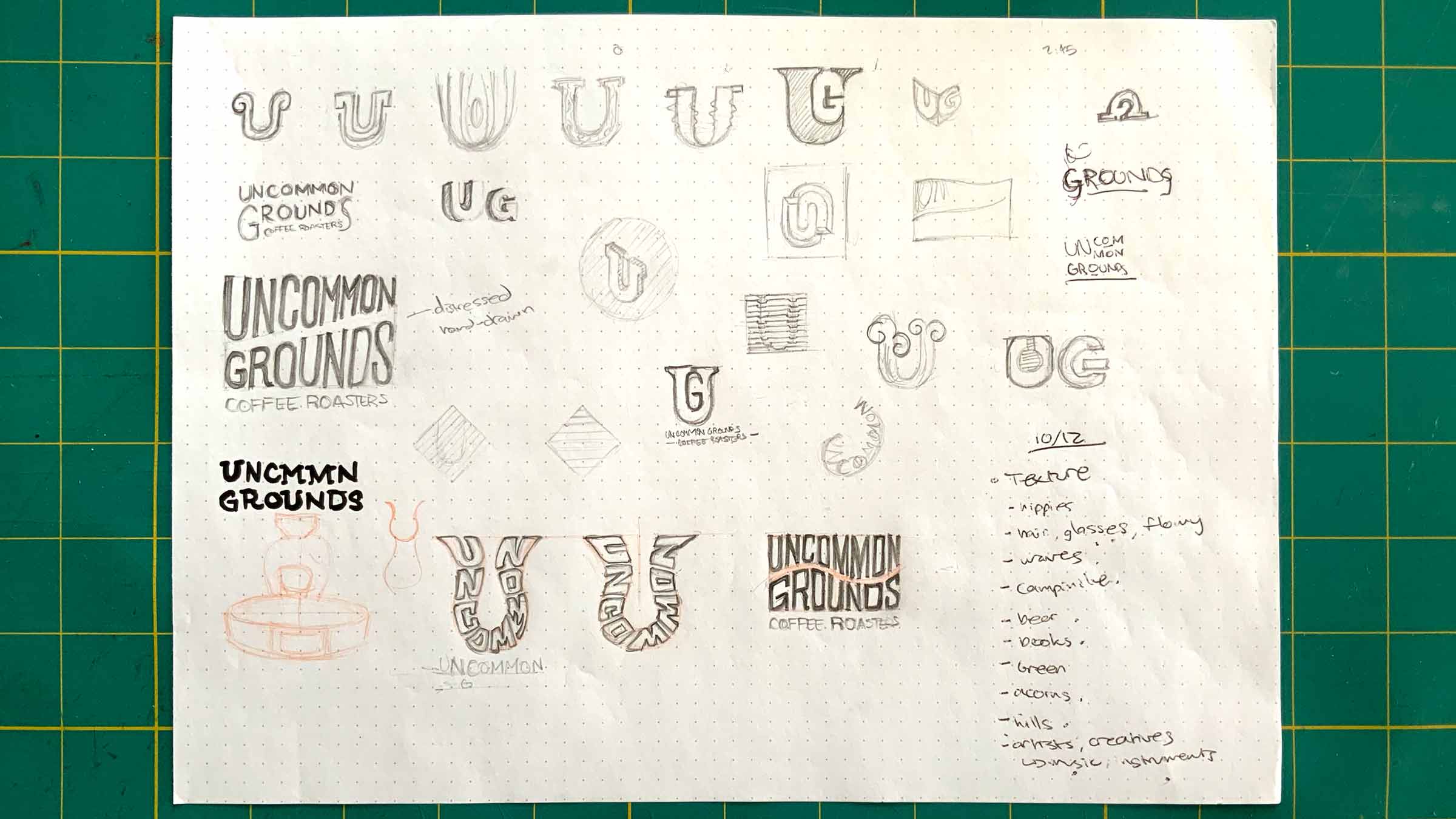
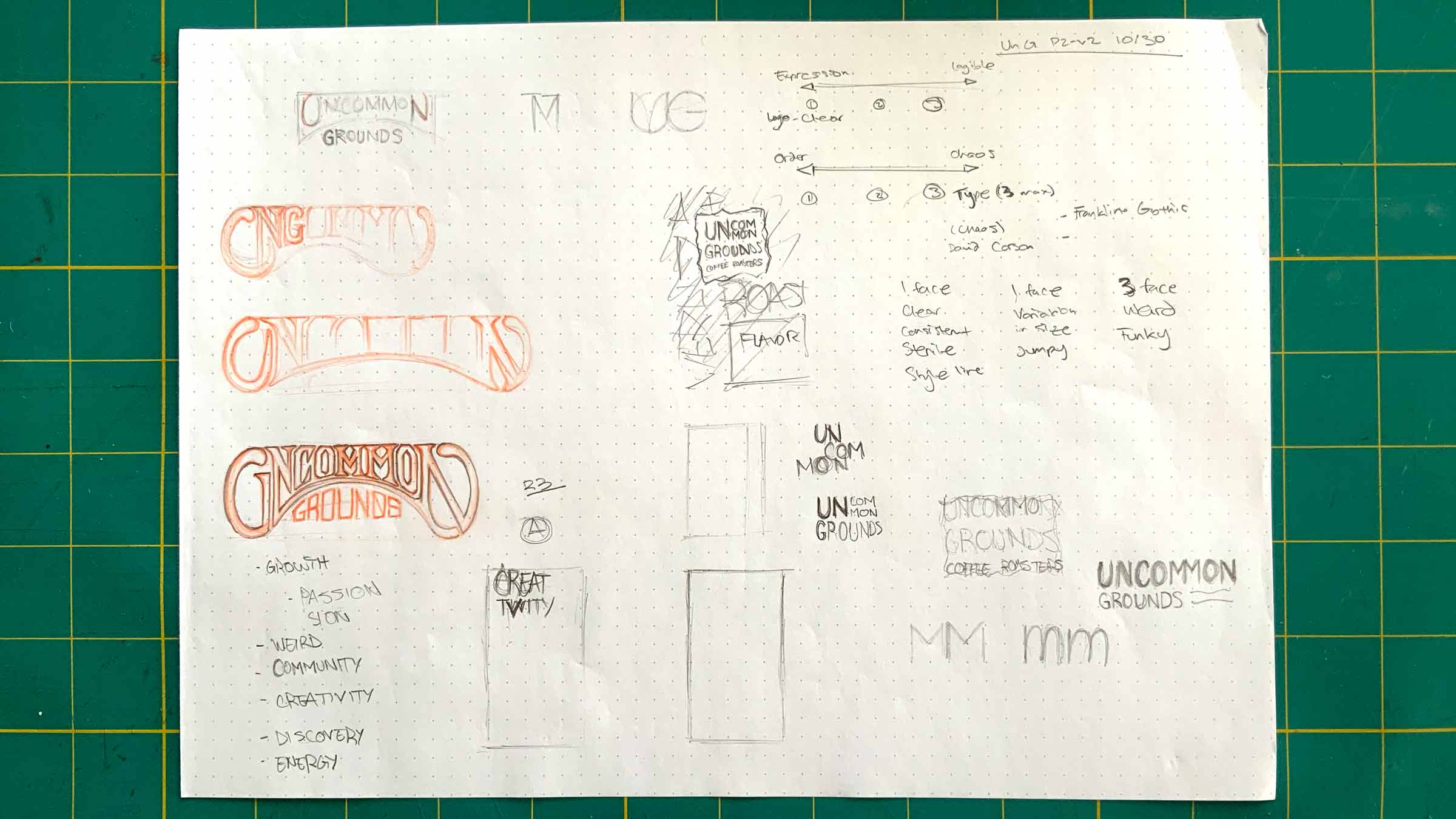
The Uncommon Grounds brand needed to honor their scars, not try to cover them up. We chose a gritty collage aesthetic that stitches together narrative and photography inspired by David Carson. This countercultural graphic design, used in underground music in the surf and skate era, alludes to the punk ethos of sticking to one’s values no matter the status quo. After working together, we can’t help but wish these uncommon values were a bit more common.
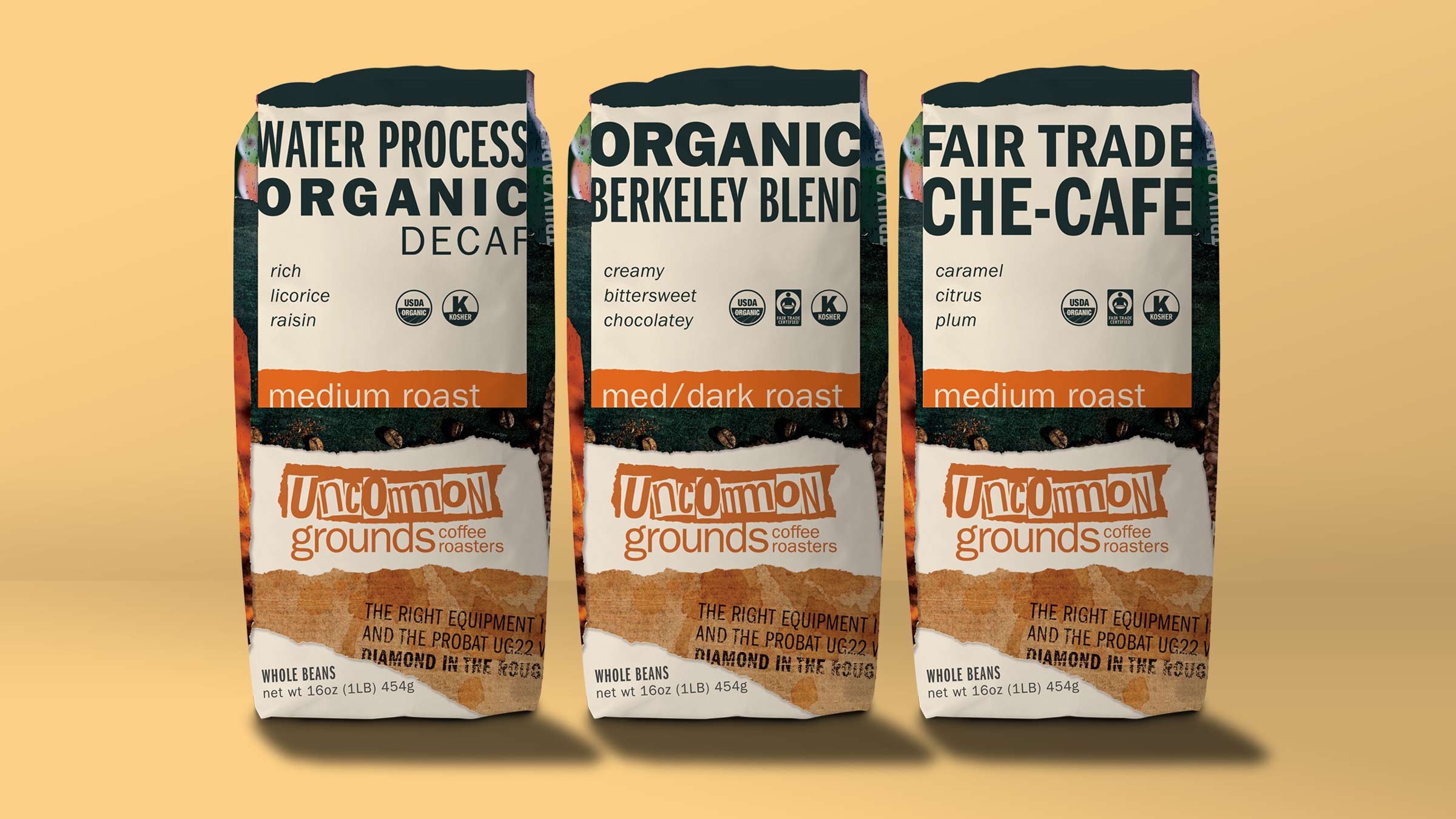
This old-school Berkeley coffee roastery was one of the first to source fair trade organic beans, supporting their producers’ longterm livelihood long before the market valued doing so. When a brutal backstab nearly killed their business, their unflinching commitment to community held them together to persevere against all odds.
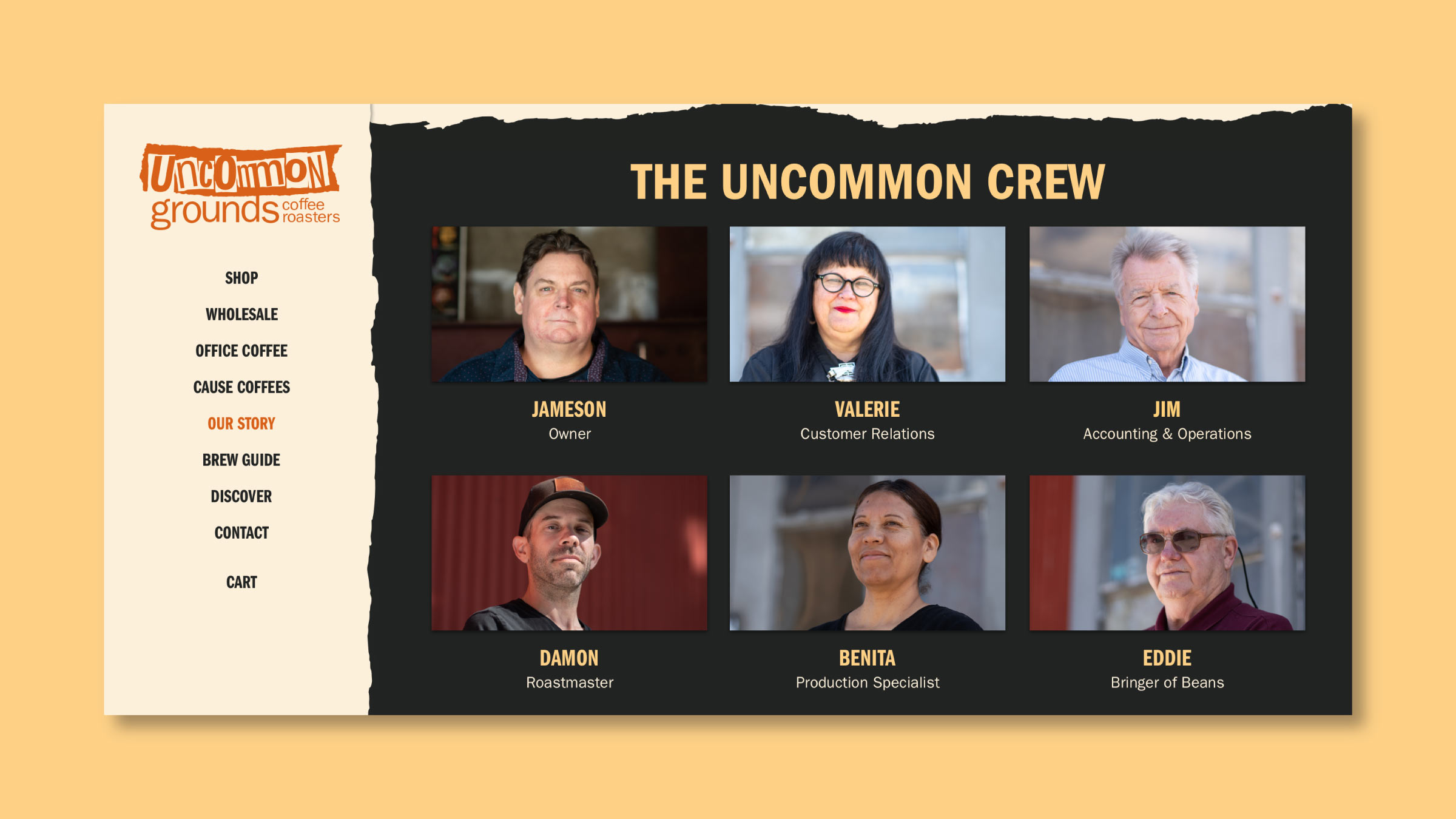
Uncommon Grounds has been serving the community cup for more than 35 years, and much of the Uncommon crew has been working together for decades. Their loyalty to each other and their creativity in the face of hardship helped them transform challenge into strength and resilience, turning the corner and walking together with chins held high.