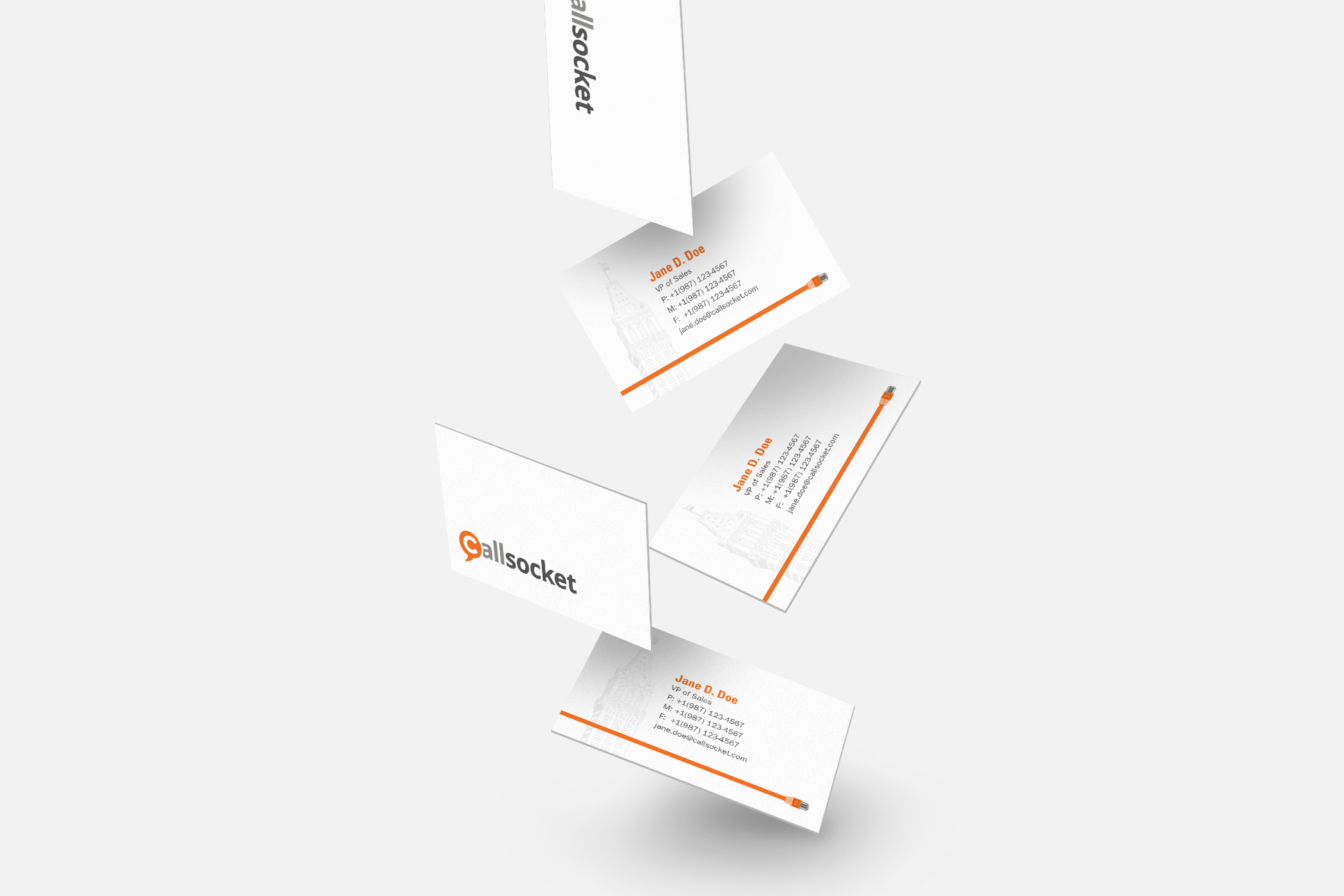
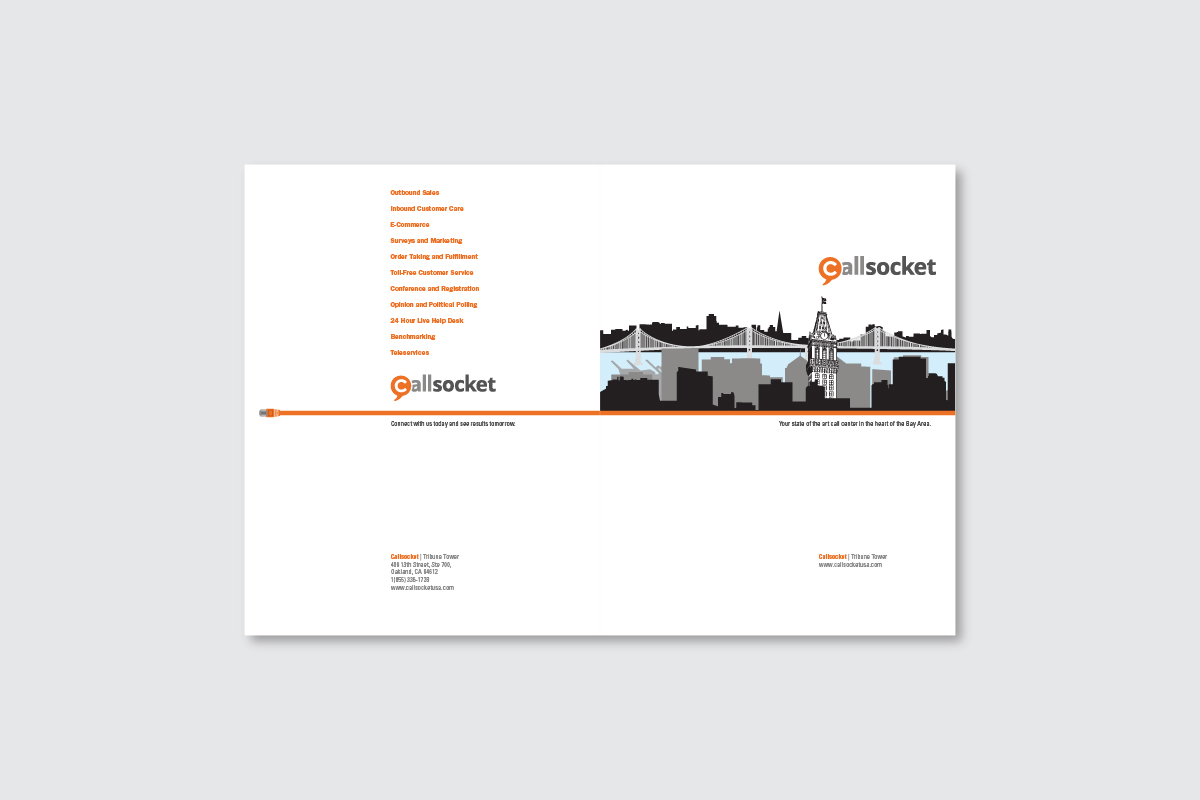
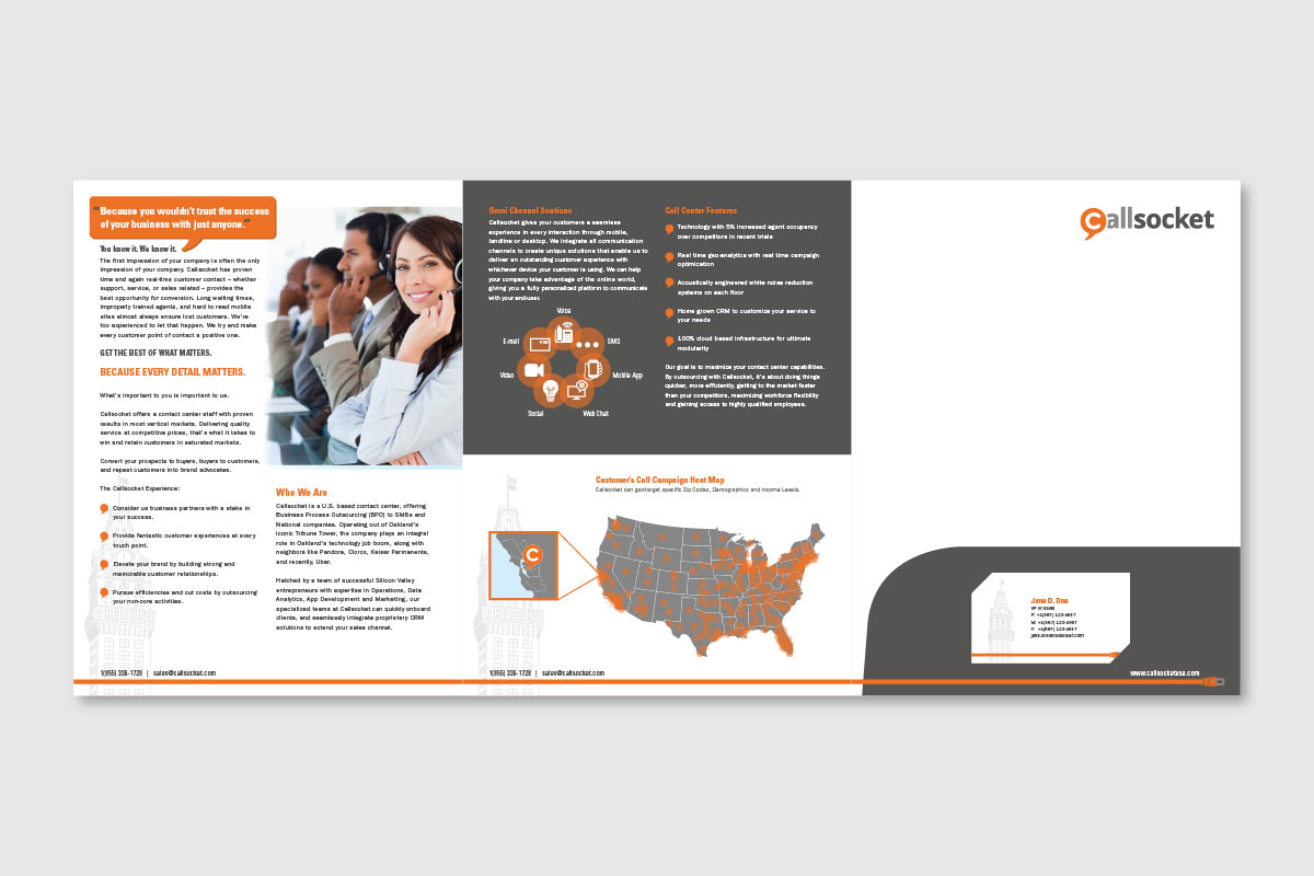
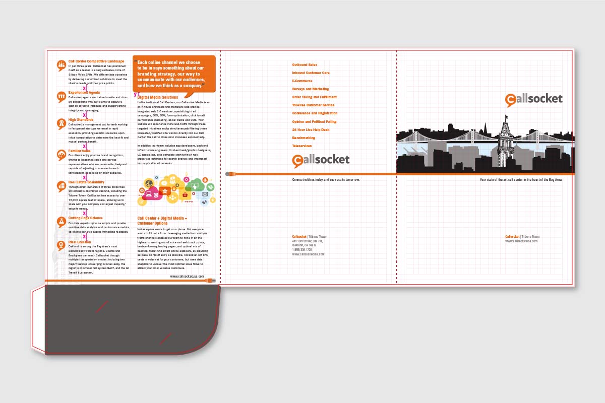
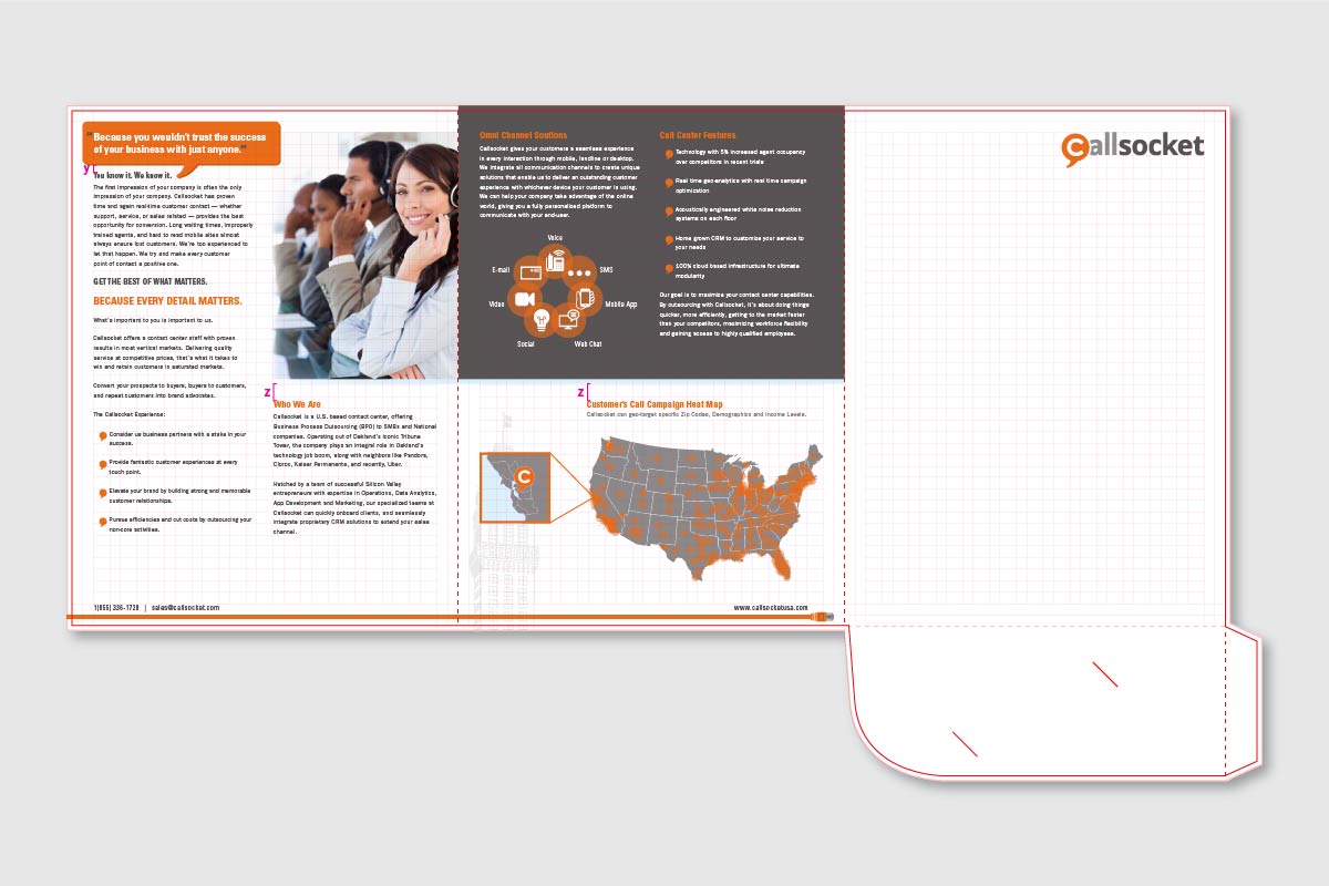
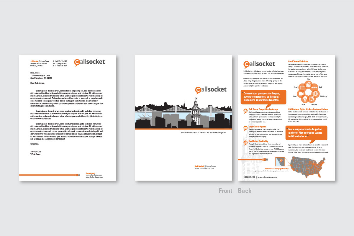
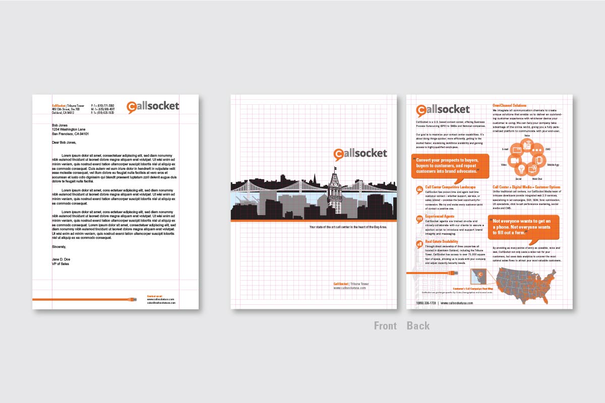
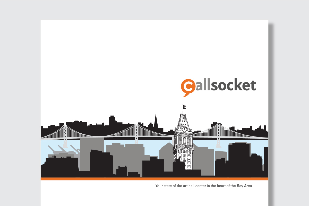
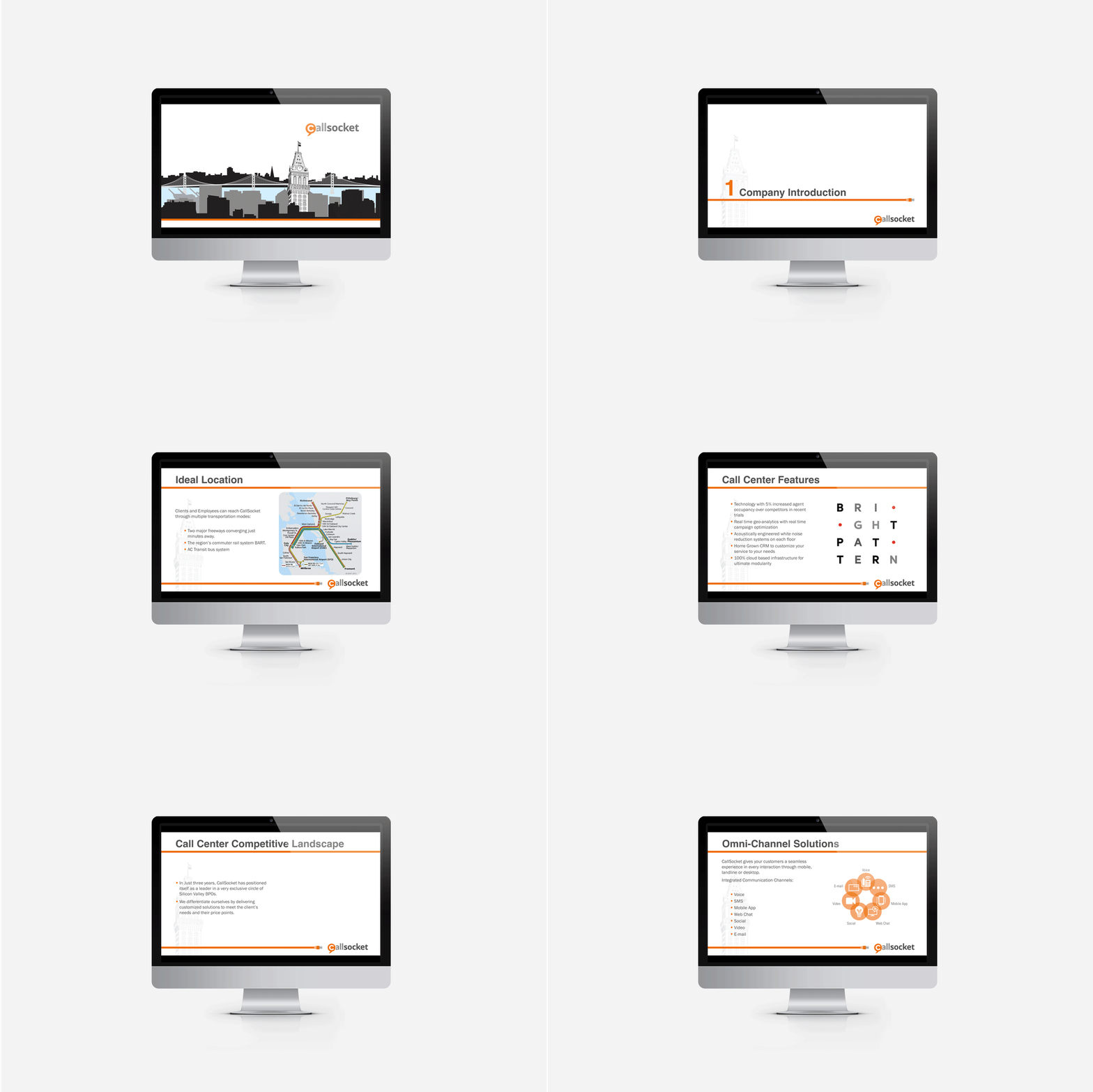
Reintroducing the Callsocket brand and bringing it to a new level of professionalism and competition through its sale collateral. The new visual story is reinforced through a dual type combo, strict color palette, icons, and illustrations. The color palette is sampled from the existing logo and extended. Modern minimalistic illustrations and icons freshen the brand visually and compliment the potential target clients in the booming tech industry of the Bay Area. The playful illustrations add a sense of friendliness and fun, while still honoring the historic Oakland Tribune Tower — now the HQ to call center, Callsocket.
Callsocket has proven time and again that real-time customer contact — whether support, service or sales — provides an unequaled opportunity to market brands and build a growing customer base. Every time customers are interacted with, it presents an opportunity to build a stronger relationship and create an unforgettable brand experience. Customers should feel like companies are going the extra mile to make sure they’re satisfied. Fantastic customer experiences at every touch point are what convert prospects to buyers, buyers to repeat customers, and customers into brand advocates.
